

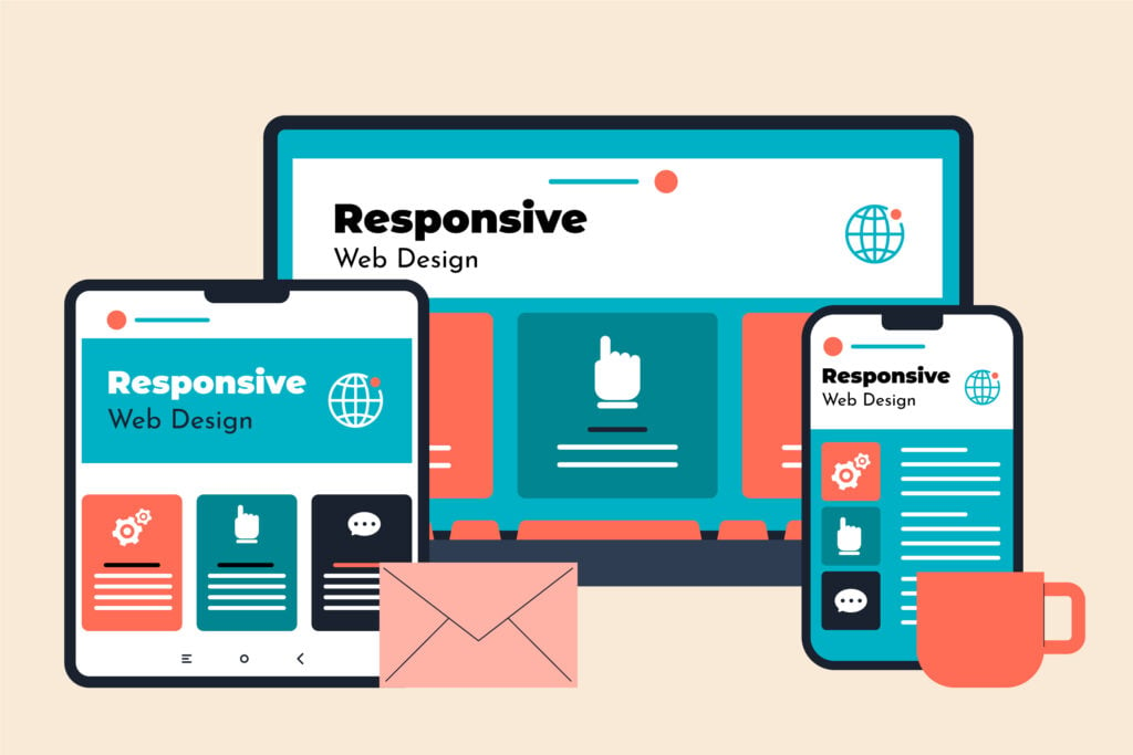
In today’s digital landscape, users interact with numerous websites daily. It is important for businesses to have responsive websites that deliver an optimal user experience across all devices, including desktops, tablets, and smartphones. As more users access the internet via mobile devices, ensuring that your website adapts to different screen sizes is essential for better engagement, accessibility, and SEO. Learning how to make an adjustable size website is crucial for providing a seamless experience across various devices.
This article will guide you through the fundamental steps of creating a responsive website, covering both the technical and design aspects to help you build a user-friendly, visually appealing, and mobile-first website. As a developer, understanding these concepts is very important to keep your customers continuing to navigate your site.
Understanding Responsive Websites
Before attempting to create a responsive website, it is important to first understand the concept of responsiveness. A responsive website is one that automatically adapts its layout and content according to the screen size and orientation of the user’s device. This is achieved through flexible grids, responsive media, and CSS media queries, ensuring that the website provides a seamless experience regardless of whether it’s viewed on a mobile phone, tablet, or desktop.
When a website is not responsive, it cannot adapt to different screen sizes and devices, resulting in a bad user experience. Users may experience issues such as distorted layouts, unclear text, or difficult navigation, which might cause frustration and drive them away. This lack of adaptability can also have a negative impact on the website’s search engine ranking, as search engines prefer mobile-friendly sites. Overall, a non-responsive website reduces accessibility and engagement, affecting client satisfaction and business success.
How to Make a Responsive Website?

Delivering an exceptional user experience is important for encouraging users to continue exploring your website. As a developer, understanding these concepts is essential for creating robust, modern web applications. Below are some key tips to help you design a responsive and user-friendly website:
1. Mobile-First Approach
Before getting into the technical aspects, it’s important to follow a mobile-first design mindset. This strategy ensures that your website is optimized for tiny displays before scaling up to larger ones. Because mobile users account for a significant amount of web traffic, beginning with a mobile-first design can help you prioritize what’s important on smaller screens.
2. Responsive Images and Media
Images and other media on your website should be adaptable to prevent layout issues on smaller screens. Using CSS, you can ensure that images are fluid and automatically resize according to the screen size. Refer to the following css code to make media responsive.
img {
	max-width: 100%;  // width set to match screen width size
	height auto;  // Set height to automatically match the aspect ratio with the width
}
This code ensures that images resize fluidly while maintaining their original aspect ratio across various screen sizes.
3. Fluid Grids and Flexible Layouts
A responsive design should incorporate a flexible grid system that adjusts seamlessly to different screen sizes. It is advisable to use percentages or relative units such as em or rem instead of fixed units like pixels, which can be overly rigid and limit adaptability. Refer to the following css code to make your layouts flexible.
.container {
  width: 100%;
  padding: 1rem;
}
In the provided CSS code, the .container class is set to have a width of 100%, allowing it to expand and contract based on the viewport size. The padding of 1rem ensures consistent spacing relative to the root font size, making the layout flexible and responsive across various screen sizes.
4. CSS Media Queries & Breakpoints
CSS media queries are the backbone of making your website responsive. These queries allow you to apply different styles depending on the screen size or orientation. You can simple implement a css media query by referring to the following css code.
@media only screen and (max-width: 600px) {
  body {
    font-size: 14px;
  }
  .container {
    padding: 0.5rem;
  }
}
When the screen size is 600 pixels or smaller, the body font size and container padding are adjusted according to the above styles, ensuring optimal readability and spacing for smaller devices.
Breakpoints allow you to apply different styles for specific screen sizes, ensuring a seamless user experience across devices. You can define breakpoints in your CSS using media queries. Below are some commonly used breakpoints for responsive design in CSS.
- 320px (for smaller devices)
- 768px (for tablets)
- 1024px – (for desktop or larger devices)
@media (max-width: 768px) {
  .sidebar {
    display: none;
  }
}
@media (min-width: 1024px) {
  .content {
    width: 75%;
  }
}
5. Viewport Meta Tag
The viewport meta tag is important for controlling the layout on mobile devices. Without it, a webpage may not scale properly on smaller screens, which can lead to poor user experience. This tag ensures that the width of the webpage matches the device’s screen width and that it doesn’t zoom out when loaded on a mobile device.
<meta name="viewport" content="width=device-width, initial-scale=1.0">6. Test on Multiple Devices
Once you have implemented various styles for different screen widths, it is essential to test the website across multiple devices to ensure it adapts correctly. Many tools are available, such as Chrome DevTools and the responsive design mode in browsers, that allow you to assess how your site adjusts to different screen sizes without the need for physical devices.
You can utilize these browser tools to test your website across various screen sizes. Additionally, you could also consider conducting user testing with real users to gather feedback and identify any usability issues that may arise on specific devices. This comprehensive approach will help ensure that your responsive design delivers an optimal user experience for all visitors.
7. Responsive Frameworks and Tools
If manually implementing responsive design using CSS feels frustrating and time-consuming, you might consider using frameworks and tools specifically dedicated to responsive design. These resources can significantly speed up the development process, enabling you to complete your work more efficiently. Below are some widely used frameworks and tools that can enhance the responsiveness on your site.
- Bootstrap
- Bootstrap is one of the most popular CSS frameworks and tools designed specifically for responsive web design. It provides pre built components and grid system to make things a lot easier for a developer.
- Foundation
- Foundation is another powerful responsive framework with flexible grids and media query support for implementing responsiveness on a website.
Best Practices for Responsive Design
While anyone can apply basic techniques to make a website responsive, following the best practices can elevate your site and set it apart from competitors. By focusing on key strategies, you can create a seamless and visually appealing experience that attracts and retains users.
The following explores some of the best practices to ensure your website not only functions responsively but stands out in a competitive landscape.
- Try to Keep it Simple
- Avoid overloading your webpage with excessive or unnecessary information, as it can negatively impact the user experience.
- Keep the design clean and straightforward, ensuring that both mobile and desktop versions provide relevant and easily accessible information.
- Optimize for Performance
- Prioritize the performance of your web application by optimizing images and scripts to ensure fast loading times, even on slower network connections.
- Touch-Friendly Design
- Ensure that buttons, links, and menus on mobile devices are easy to interact with, providing a seamless and user-friendly touch experience.
- Prioritize Contents
- Prioritize the content on your webpage to ensure that, even on smaller screens, only the most important information is displayed, minimizing unnecessary details.
Conclusion
Responsive design is not just about making a website look good on smaller screens; it’s about delivering the best possible user experience, regardless of the device being used. By following the tips outlined in this article on how to create a responsive website, you can ensure that your website provides a seamless and engaging experience across all platforms.
However, it’s always important to test thoroughly and keep up with the latest trends in responsive web design to stay ahead of the curve. With the steps outlined in this guide, you’ll be well on your way to building responsive, future-proof websites for your users.

FAQs
Why should I adopt a mobile-first approach when designing a website?
- A mobile-first approach ensures that your website is optimized for smaller screens before scaling up to larger ones. Since a significant portion of web traffic comes from mobile devices, designing for mobile users first helps you focus on essential features and content. It also makes your website load faster and perform better on mobile, which can improve user experience and SEO rankings.
How can I test if my website is responsive across multiple devices?
- To test your website’s responsiveness, you can use browser tools like Chrome DevTools to simulate various screen sizes. There are also online tools like Responsinator that show how your site looks on different devices. For real-world testing, it’s best to check your site on actual smartphones, tablets, and desktop computers to ensure it adapts smoothly to all screen sizes and devices.
What’s the difference between using px, em, and rem units in responsive design?
- In responsive design, using relative units like
emandreminstead of fixed units likepxallows your layout and text to scale fluidly across different screen sizes.pxare fixed units and do not adapt to different screen sizes.emis a relative unit based on the parent element’s font size, making it useful for scaling elements proportionally within a specific section.remis also relative but based on the root (HTML) font size, offering more consistency across the entire site. This helps maintain a cohesive design when scaling content for different devices.


